本記事では、ReactとMUIを使ってモーダルウインドウ上で入力フォームを作成する方法をご紹介します。
本記事上で具体的なソースコードを載せてますので、そのまま利用することが可能です。
なので、
細かい説明はいいから、コピペで自分のアプリにモーダルウインドウを組み込みたい。
と、いう方におすすめです。
ReactとMUIの説明は本記事では割愛しております。ReactとMUIについて知りたい方は以下記事を参照ください。

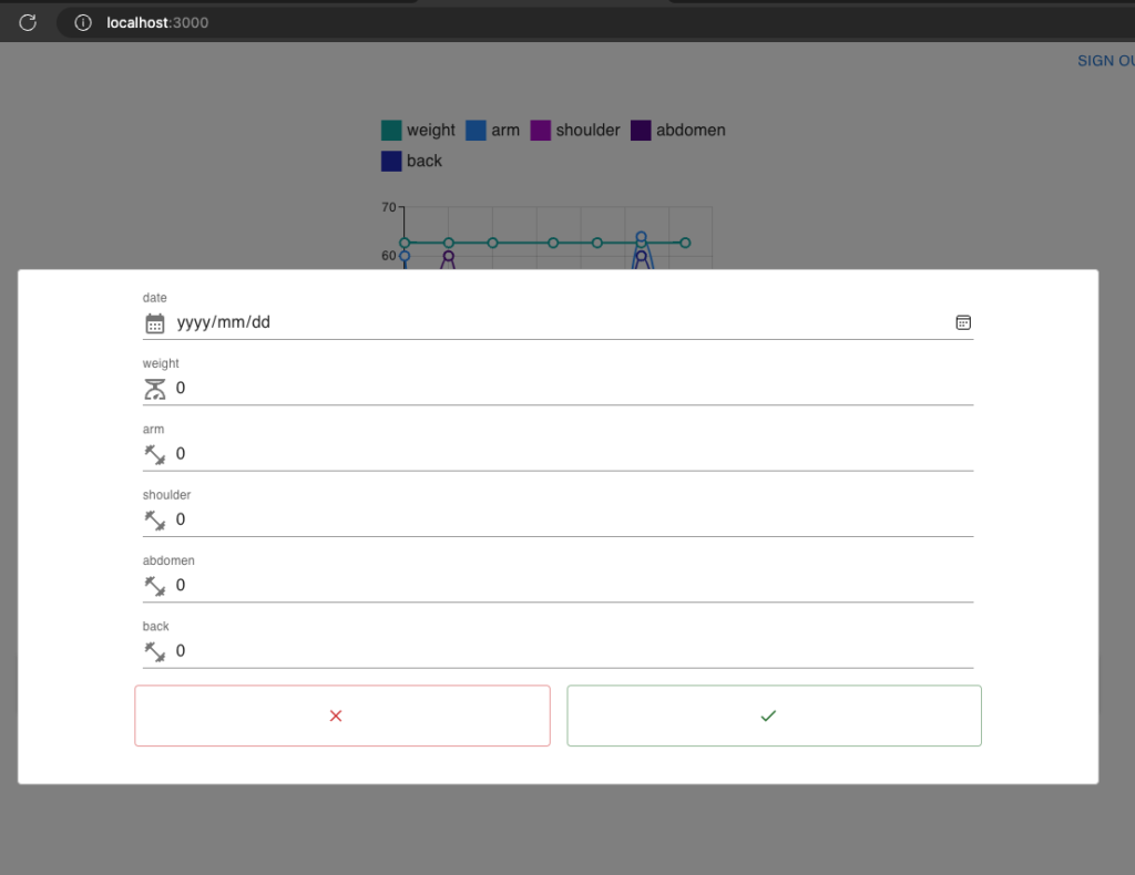
本記事で作成するモーダルウインドウ
作成するモーダルウインドウ
以下のモーダルウインドウを作成します。新規にデータを登録するための入力フォームです。今回モーダルウインドウを組み込むアプリは、体重と筋トレ回数を記録する個人開発中のアプリですが、どんなアプリにも簡単にモーダルウインドウを組み込むことが可能です。
モーダルウインドウとは
そもそもモーダルウインドウってなに?
メインウインドウ(メイン画面)から呼び出されるサブウインドウ(サブ画面)の一つです。サブウインドウとは異なり、ウインドウ表示中はメインの画面を操作できなくしたものをモーダルウインドウと呼びます。
モーダルウインドウの実装
ライブラリのインストール
筆者はnpmを使っているので、npmでご紹介します。
Reactプロジェクトのフォルダに移動し、以下コマンドを実行します。
npm install --save react-modal実装
以下のようなソースコードとなります。
import './App.css';
import React, { useState,useEffect } from 'react';
import {
  Box,
  Button,
  TextField,
  Chip,
  Container,
  InputLabel,
} from '@mui/material';
import {
  Add as AddIcon, Edit as EditIcon, DeleteOutlined as DeleteIcon, Save as SaveIcon, Close as CancelIcon,
  LineAxis as LineAxisIcon, MultilineChart as MultilineChartIcon, Dataset as DatasetIcon, Done as DoneIcon , Close as CloseIcon,
  ScaleTwoTone as ScaleTwoToneIcon, FitnessCenterTwoTone as FitnessCenterTwoToneIcon, CalendarMonth as CalendarMonthIcon
} from '@mui/icons-material';

// モーダル関連
import Modal from "react-modal";
import InputAdornment from '@mui/material/InputAdornment';


function App() {

  // 入力内容保持用state
  const [inputDate, setInputDate] = useState(new Date(date));
  const [inputWeight, setInputWeight] = useState(0);
  const [inputTrainingArm, setInputTrainingArm] = useState(0);
  const [inputTrainingShoulder, setInputTrainingShoulder] = useState(0);
  const [inputTrainingAbdomen, setInputTrainingAbdomen] = useState(0);
  const [inputTrainingBack, setInputTrainingBack] = useState(0);


  // モーダルウインドウ関連
  const [editModalIsOpen, setEditModalIsOpen] = useState(false);
  function updateLunchList() {
    ・・・割愛・・・
  }
  const closeModal = () => {
    setEditModalIsOpen(false);
  };

  return (
          <Box display="flex" flexDirection='column' alignItems="center">
        ・・・メインウインドウのコンテンツ
              // モーダルウインドウを表示するボタン
              <Box sx={{ width: '90%'}}>
                <Button style={{width:'100%', height: '60px'}} variant="contained" startIcon={<AddIcon/>} color="secondary" onClick={() => {setEditModalIsOpen(true);}}></Button>
              </Box>
          </Box>
          <Box m={2}>
            <Modal
              isOpen={editModalIsOpen}
              onRequestClose={closeModal}
              style={{
                overlay: {
                  display: 'flex',
                  alignItems: 'center',
                  justifyContent: 'center',
                  backgroundColor: 'rgba(0, 0, 0, 0.5)', // 背景の透明度を調整
                },
                content: {
                  position: 'relative',
                  top: 'auto',
                  left: 'auto',
                  right: 'auto',
                  bottom: 'auto',
                  maxWidth: '90%', // モーダルの最大幅を調整
                  maxHeight: '90%', // モーダルの最大高さを調整
                  transform: 'none', // 位置調整のためのtransformをリセット
                  width: '90%'
                },
              }}
            >
              <Box mb={2}>
                <Box sx={{ display: 'flex', flexDirection: 'column', gap: 2 }}>
                  <Box display="flex" justifyContent="center">
                    <TextField id="date-field" label="date" variant="standard" type="date"
                      value={inputDate} onChange={(e) => setInputDate(e.target.value)} sx={{ width: '80%'}}
                      InputProps={{
                        startAdornment: (
                          <InputAdornment position="start">
                            <CalendarMonthIcon />
                          </InputAdornment>
                        ),
                      }} />
                  </Box>
                  <Box display="flex" justifyContent="center">
                    <TextField id="weight-field" label='weight' variant="standard" type="number"
                      value={inputWeight} onChange={(e) => setInputWeight(e.target.value)} sx={{ width: '80%'}}
                      InputProps={{
                        startAdornment: (
                          <InputAdornment position="start">
                            <ScaleTwoToneIcon />
                          </InputAdornment>
                        ),
                      }} />
                  </Box>
                  <Box display="flex" justifyContent="center">
                    <TextField id="arm-field" label="arm" variant="standard" type="number"
                      value={inputTrainingArm} onChange={(e) => setInputTrainingArm(e.target.value)} sx={{ width: '80%'}}
                      InputProps={{
                        startAdornment: (
                          <InputAdornment position="start">
                            <FitnessCenterTwoToneIcon />
                          </InputAdornment>
                        ),
                      }} />
                  </Box>
                  <Box display="flex" justifyContent="center">
                    <TextField id="shoulder-field" label="shoulder" variant="standard" type="number"
                      value={inputTrainingShoulder} onChange={(e) => setInputTrainingShoulder(e.target.value)} sx={{ width: '80%'}}
                      InputProps={{
                        startAdornment: (
                          <InputAdornment position="start">
                            <FitnessCenterTwoToneIcon />
                          </InputAdornment>
                        ),
                      }} />
                  </Box>
                  <Box display="flex" justifyContent="center">
                    <TextField id="abdomen-field" label="abdomen" variant="standard" type="number"
                      value={inputTrainingAbdomen} onChange={(e) => setInputTrainingAbdomen(e.target.value)} sx={{ width: '80%'}}
                      InputProps={{
                        startAdornment: (
                          <InputAdornment position="start">
                            <FitnessCenterTwoToneIcon />
                          </InputAdornment>
                        ),
                      }} />
                    </Box>
                  <Box display="flex" justifyContent="center">
                    <TextField id="back-field" label="back" variant="standard" type="number"
                      value={inputTrainingBack} onChange={(e) => setInputTrainingBack(e.target.value)} sx={{ width: '80%'}}
                      InputProps={{
                        startAdornment: (
                          <InputAdornment position="start">
                            <FitnessCenterTwoToneIcon />
                          </InputAdornment>
                        ),
                      }} />
                  </Box>
                  <Box sx={{ display: 'flex', flexDirection: 'row', gap: 2 }} justifyContent="center" >
                    <Button variant="outlined" color="error" startIcon={<CloseIcon />} onClick={closeModal} sx={{ width: '40%', height: '60px'}}></Button>
                    <Button variant="outlined" color="success"  startIcon={<DoneIcon />} onClick={updateForFormData} sx={{ width: '40%', height: '60px'}}></Button>
                  </Box>
                </Box>
              </Box>

            </Modal>
          </Box>
  );
}

export default App;
ポイント
上記ソースコードからポイントを解説します。
モーダルコンポーネントを利用するため、react-modalをインポートします。
// モーダル関連
import Modal from "react-modal";
モーダルウインドウのオープン・クローズ状態を管理するstateを定義します。
const [editModalIsOpen, setEditModalIsOpen] = useState(false);モーダルウインドウを閉じるための関数を作成します。stateの値と連動してウインドウの表示・非表示を切り替えるため、処理はstateの値をFalseにするだけです。
  const closeModal = () => {
    setEditModalIsOpen(false);
  };
モーダルコンポーネントのisOpenプロパティに上で作成したstateの関数を設定します。これによりstateの値と連動してウインドウが開くようになります。
また、onRequestCloseプロパティに上で解説した関数を設定します。これにより、画面上のモーダルウインドウ以外の部分をクリックするとcloseModal関数が呼び出され、モーダルウインドウが閉じられるようになります。
            <Modal
              isOpen={editModalIsOpen}
              onRequestClose={closeModal}
              ・・・
メインウインドウ上に、モーダルウインドウを起動するボタンを配置します。以下コードのようにすると、ボタンをクリックすることで、モーダルウインドウが開くようになります。
              <Box sx={{ width: '90%'}}>
                <Button style={{width:'100%', height: '60px'}} variant="contained" startIcon={<AddIcon/>} color="secondary" onClick={() => {setEditModalIsOpen(true);}}></Button>
              </Box>
まとめ
ReactとMUIでモーダルウインドウを実装するまとめ
本記事では、ReactとMUIを使ってモーダルウインドウを作成する方法をご紹介しました。
ReactとMUIを利用することで、驚くほど簡単にモーダルウインドウを作成することができます。モーダルウインドウの利用はトレンドであるモダンアプリには必要不可欠ですので、このように簡単に作成できる方法を知っていると開発速度が速くなります。
今後もReactを使ったSPA方式のアプリケーションの便利な開発手法をご紹介していきます。
皆様の参考になりましたら幸いです。

コメント